Powerful branding for a strong chain in the healthcare network
Volta developed the corporate brand identity for this new organisation, without compromising the individual identities of member hospitals.
From diagnosis to treatment
After an initial diagnosis, we created a new brand identity interwoven with medical symbolism. After three intensive workshops with representatives from each affiliated care centre, our team worked around the textual and visual interpretation of this new brand. In mutual consultation with the individual hospitals, we finally chose the name “Helix”.
Helix: more than just a shape
There's a lot more to the name ‘Helix’ than you might think. Firstly, the connecting network name Helix refers to healing, nurturing and coordinating. In addition, it also refers directly to the spiral shape that makes up DNA. What's more, the name also refers to the Latin 'hedera helix', which translates as 'growing towards the light'.
Subtle, uplifting imagery
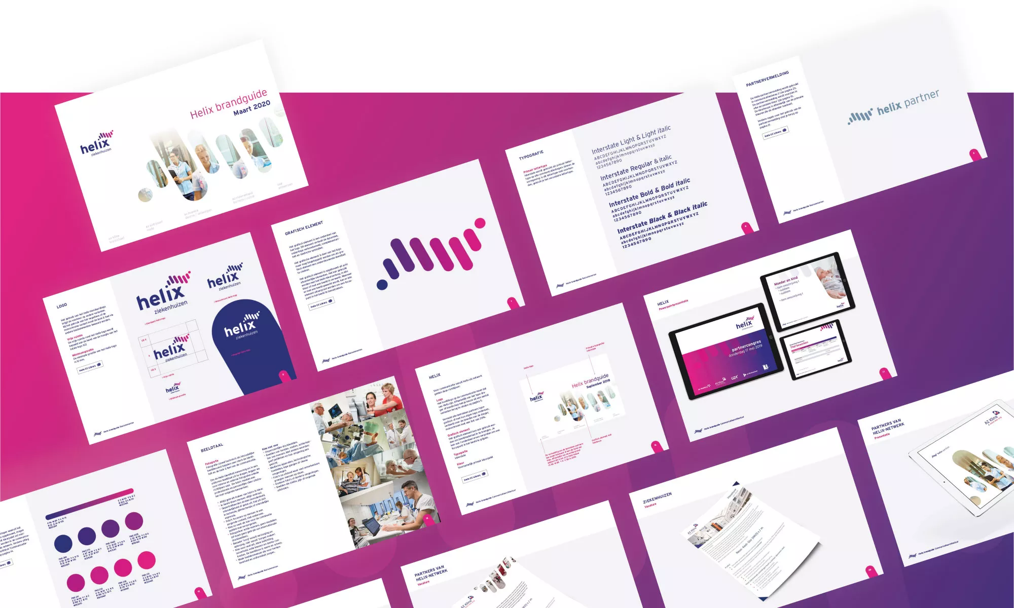
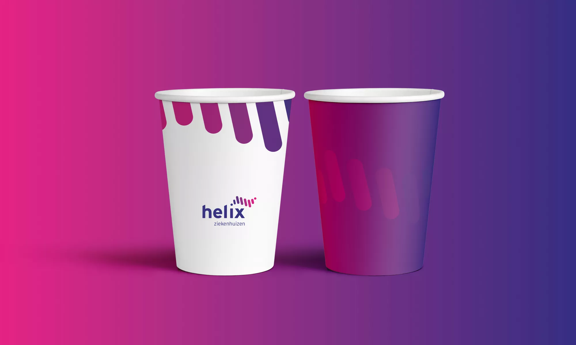
Integrating the spiral shape into the logo and visual language was therefore a natural choice. The graphic element - the helix - is part of the logo. This element translates dynamism, interconnectivity, complementarity, excellence and medical symbolism.
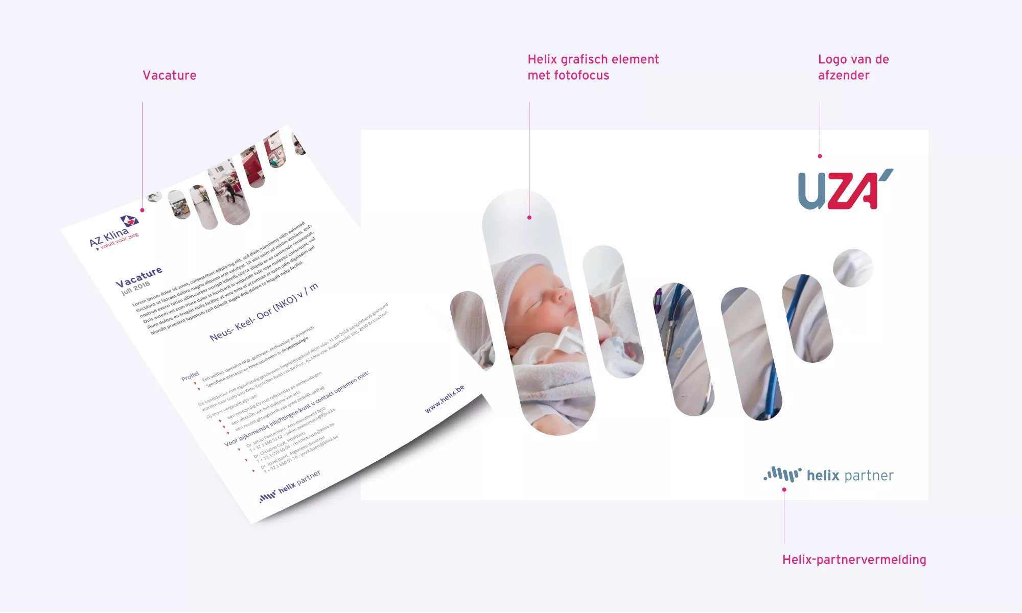
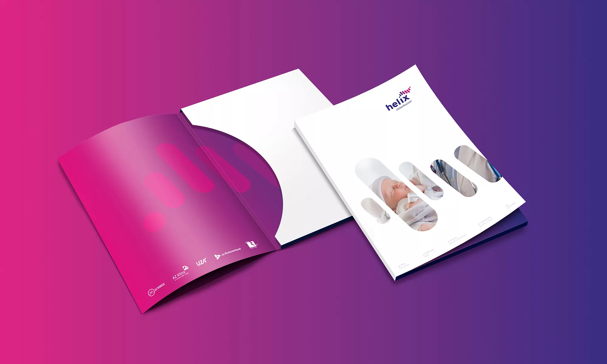
On its own, the graphic element creates a supporting and overarching identity. By using it, among other things, as a cutout over photographic material, we establish the link between the healthcare activities and the overarching network.
We're getting very positive reactions to the launch of our corporate identity. The forward-looking, open concept conveys a story of inclusion.
