An even more sustainable image for Fost Plus
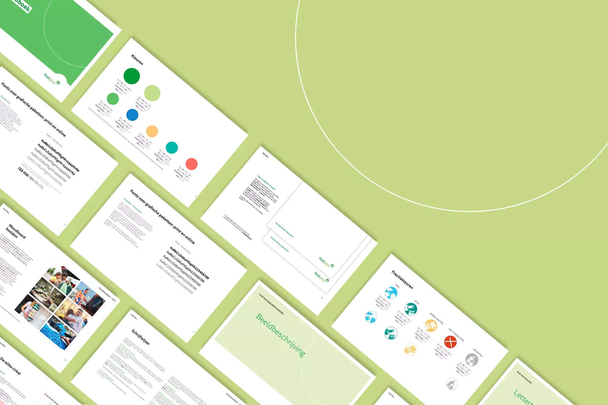
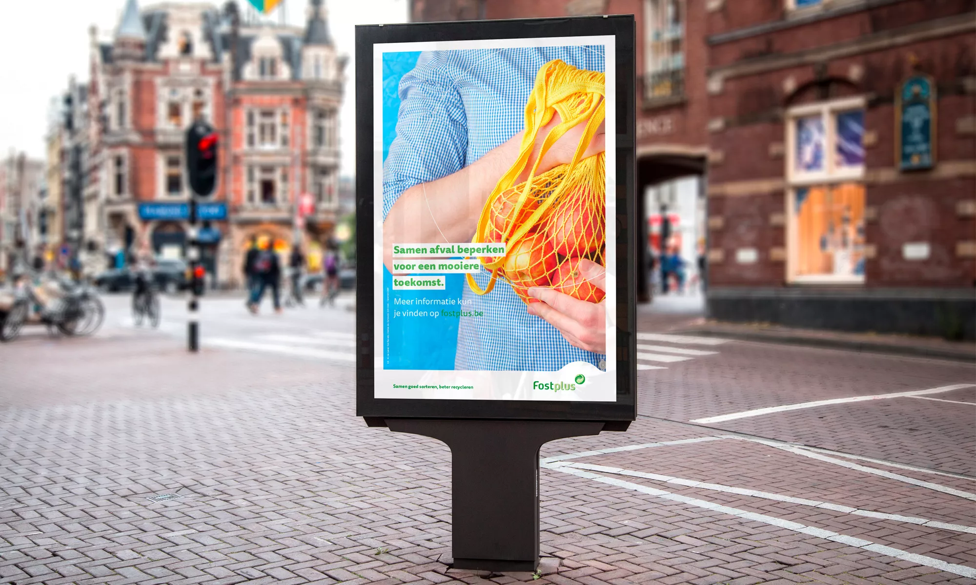
We revamped the corporate identity of Fost Plus in a sustainable way with recycled, upgraded visual elements. Consistency is the key word here.
Let's recycle!
As every Belgian recognises the Fost Plus logo, we obviously couldn't touch that sacred icon. By skilfully recycling some graphic elements, we further increased the recognition factor.
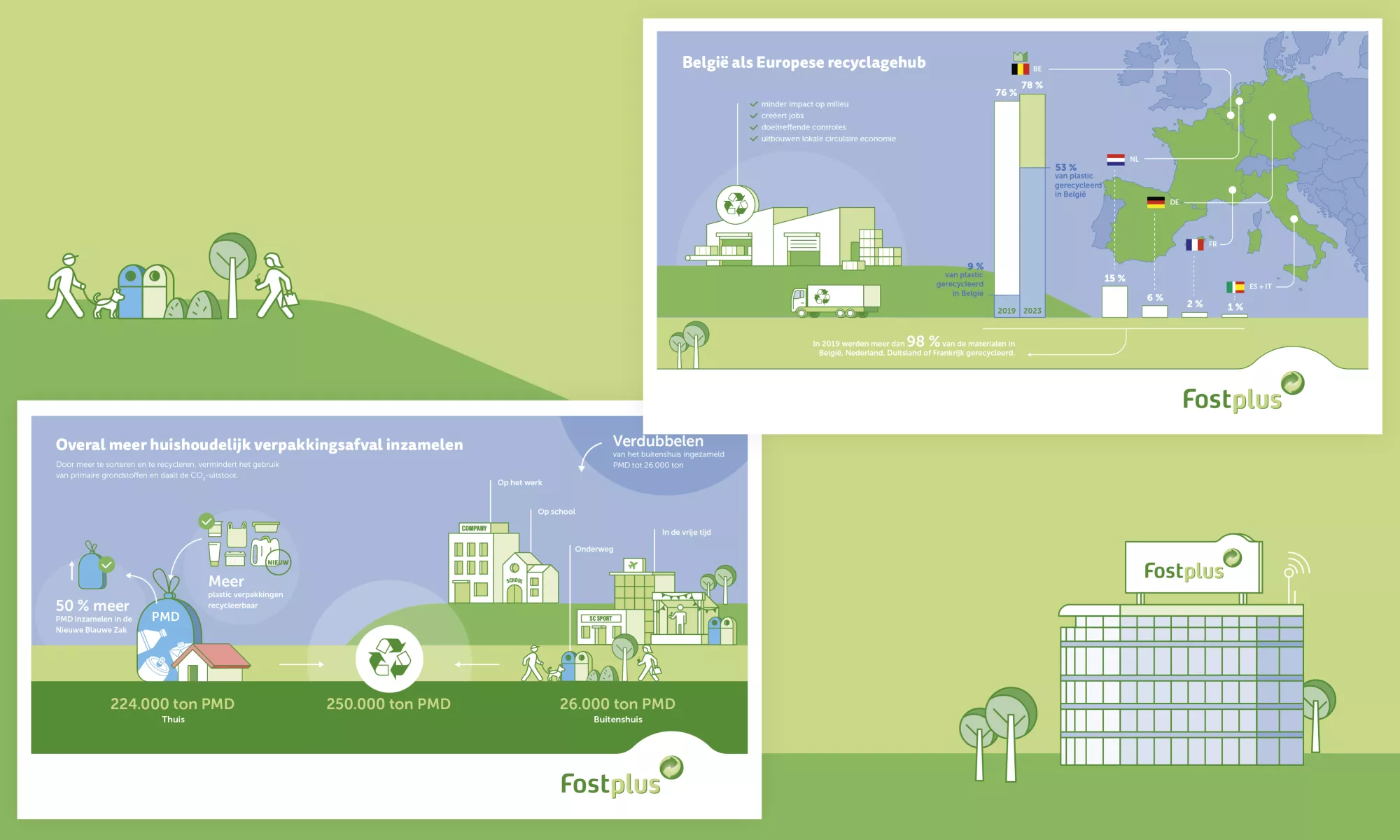
How did we do that? With an ‘arch’ and a ‘white circle’, we brought playful touches symbolising the circular story of Fost Plus. And with a light interplay of lines and clean illustrations, the image of Fost Plus was given a modern boost.
Consistency is key
Consistency is of the essence. This is the only way to achieve crisp communication. That is why we described the corporate identity in great detail: from the exact positioning of the logo and baseline to the spelling of dates. A fixed grid guarantees a sleek design.
Extra guidance
With additional visual and linguistic descriptions, we defined clear guidelines for each form of communication, including digital applications of course.
Our flagship: infographics
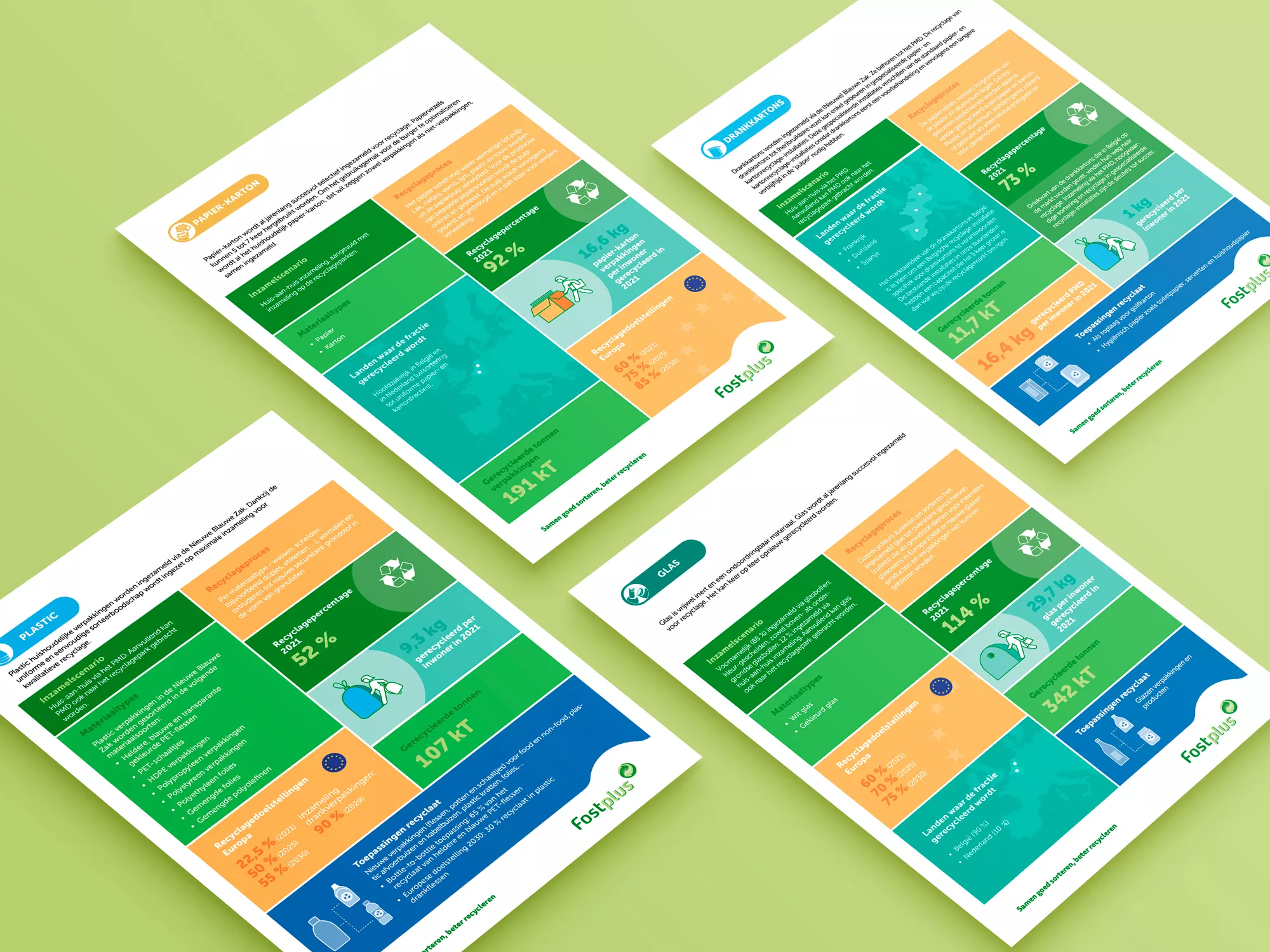
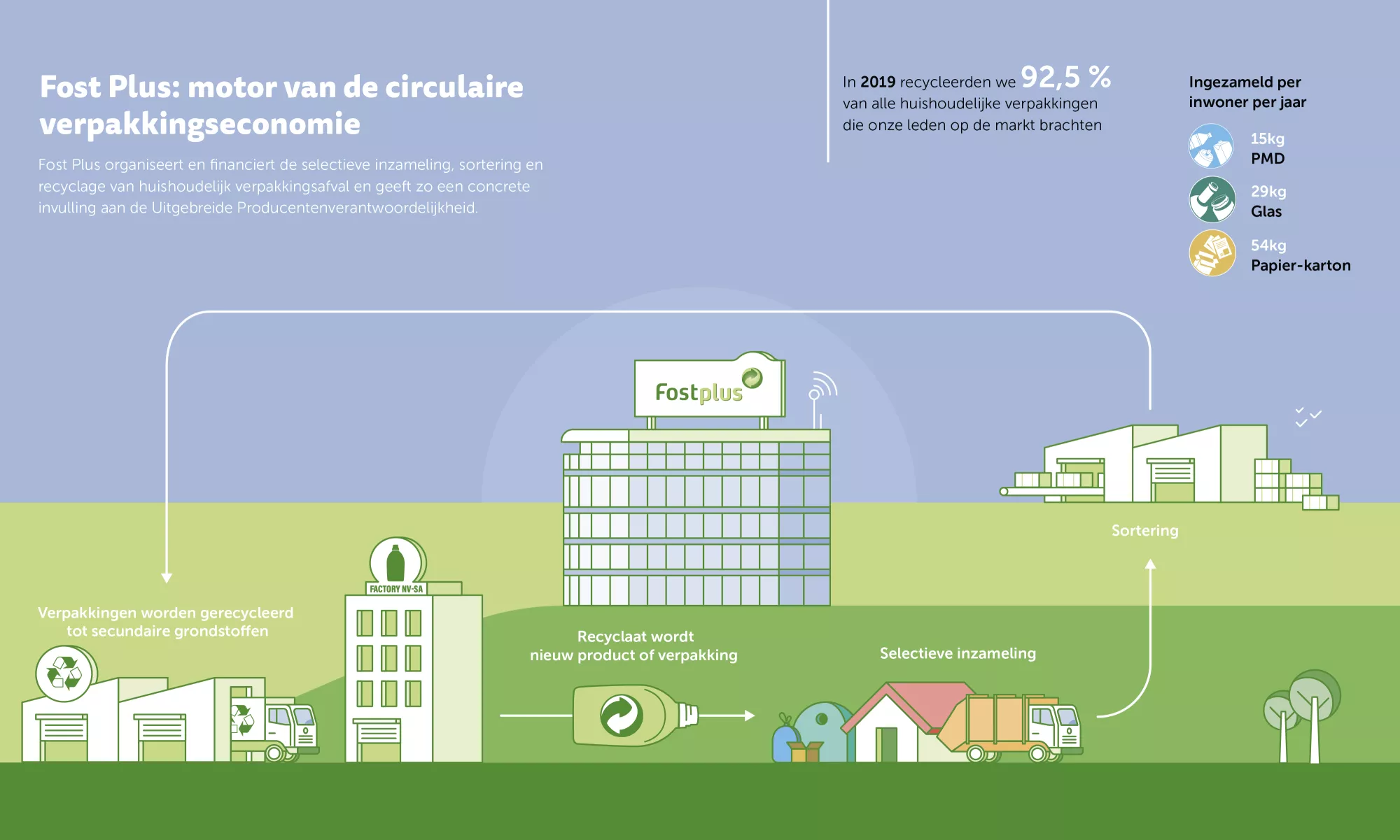
How do you present fairly dry information in a playful way? With an infographic, of course: a mix of illustrations, graphics and text. We created five crystal-clear infographics that immediately get across the impact of Fost Plus.
Sorting out sorting
And those icons with sorting instructions? Those are also our designers' brainchild. The trilingual, modular blocks have been adorning all product packaging in Belgian supermarkets ever since. Plain and simple, whatever the size or shape of the product.
