The right path towards innovation
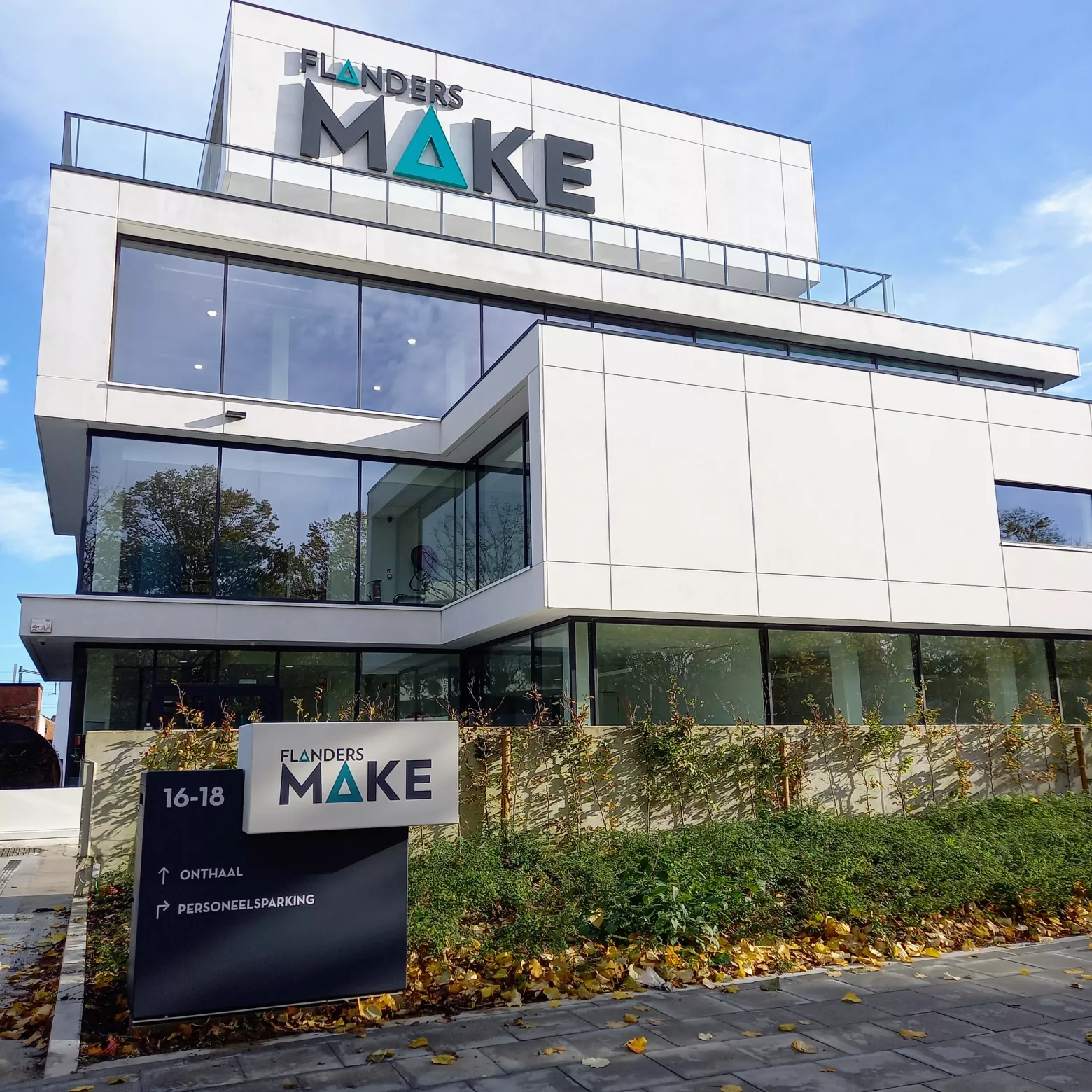
We injected all our enthusiasm into designing all the signage and icons for the brand-new headquarters of Flanders Make in Kortrijk. Every visitor can now effortlessly negotiate the innovation and technology of this magnificent building.
How do you draw attention to signage in a building? And how do you guide a visitor without a hitch through the maze of meeting rooms, offices and floors? Our solution: fusing technology and minimalism into a sleek signage that catches the eye.
Visible innovation ... through signalling
For several years now, we have been bringing innovation to life through the annual report for Flanders Make, the research centre around innovation in the manufacturing industry. In its latest editions, it announced the construction and opening of their new technology centre in Kortrijk. As such, we were more than happy to get behind our drawing board to design the signage for that building.
A building's brand identity
This kind of signage isn't just about directions and a floor plan, it also has to convey a brand identity. They came to the right people. From the first discussions with the Flanders Make team, we grasped the general approach and worked out our initial concepts.
Logical routing and landmarks
Our visual approach was quickly decided: the entire building had to live and breathe innovation from the moment you step inside. All elements of the signage had to take the visitor on a colourful and dynamic journey through technological ingenuity. However, this obviously had to be a journey that takes you smoothly from point A to B: without detours and via logical routes and landmarks.
Smart iconography
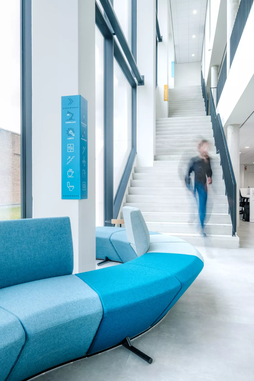
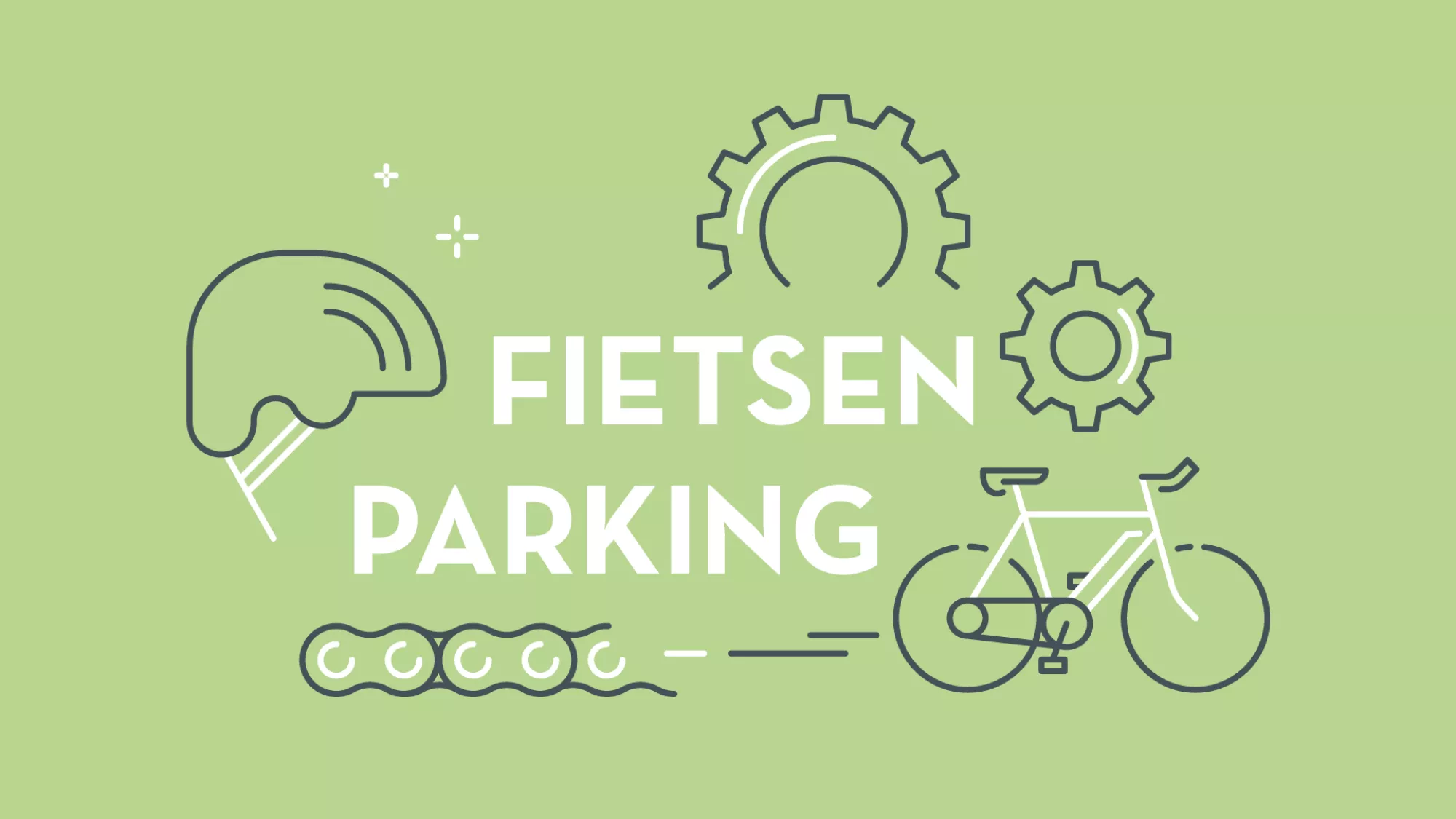
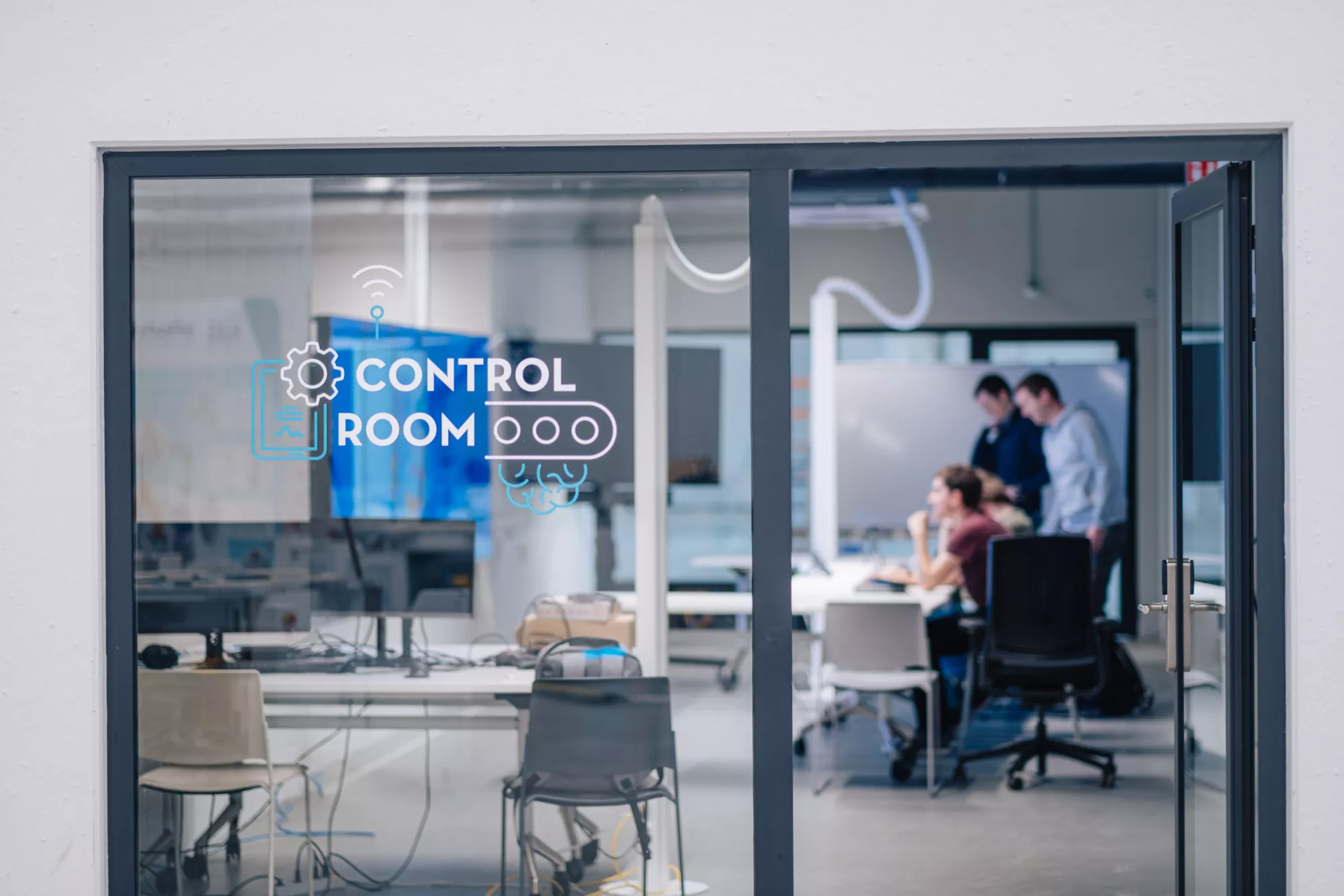
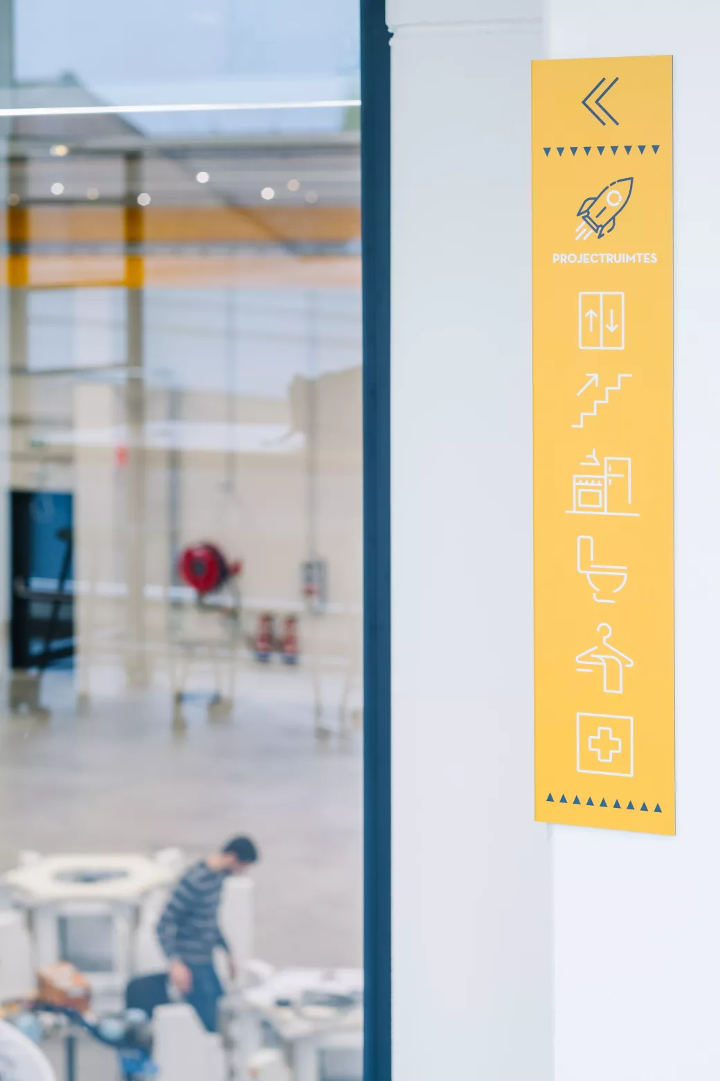
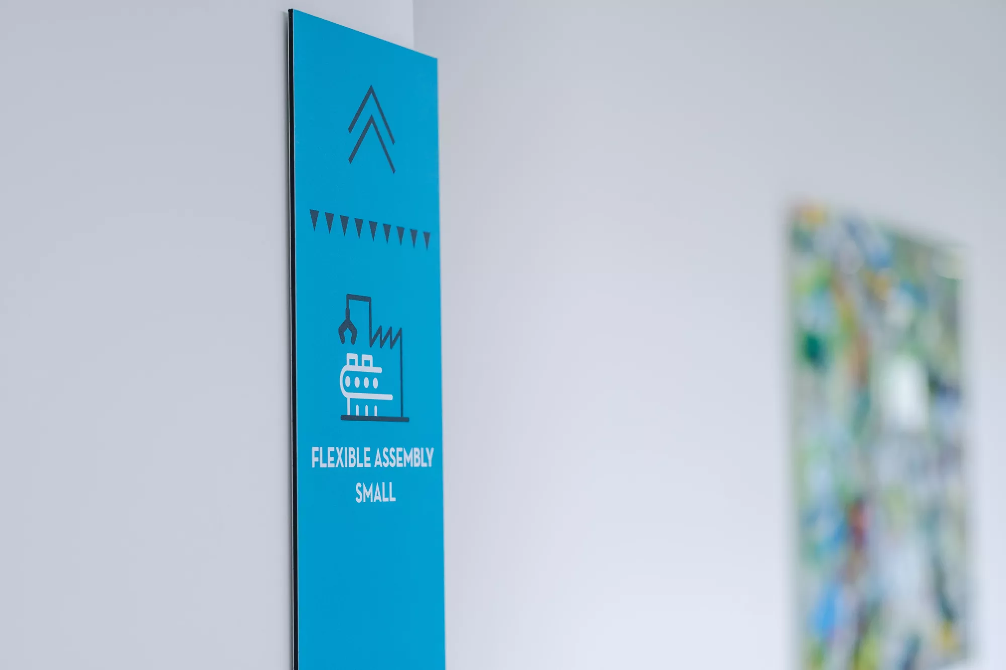
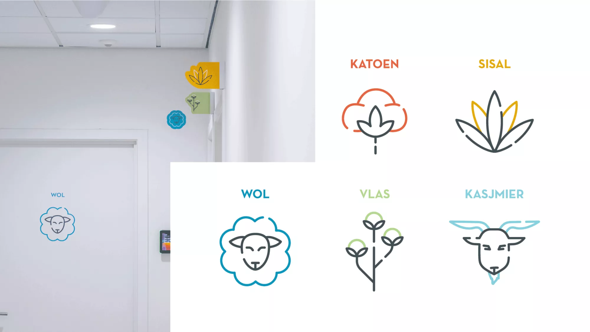
Above all, our signage had to be recognisable... so not too overwhelming. We brought the site to life with a clever mix of corporate colours and smart iconography. We drew inspiration from the furniture and fittings in the building: a mix that, together with the brand colours, immediately created a familiar look. Clean lines and minimalist, bespoke icons gave each sign a touch of modernity.
Legible floor plan, clear directions
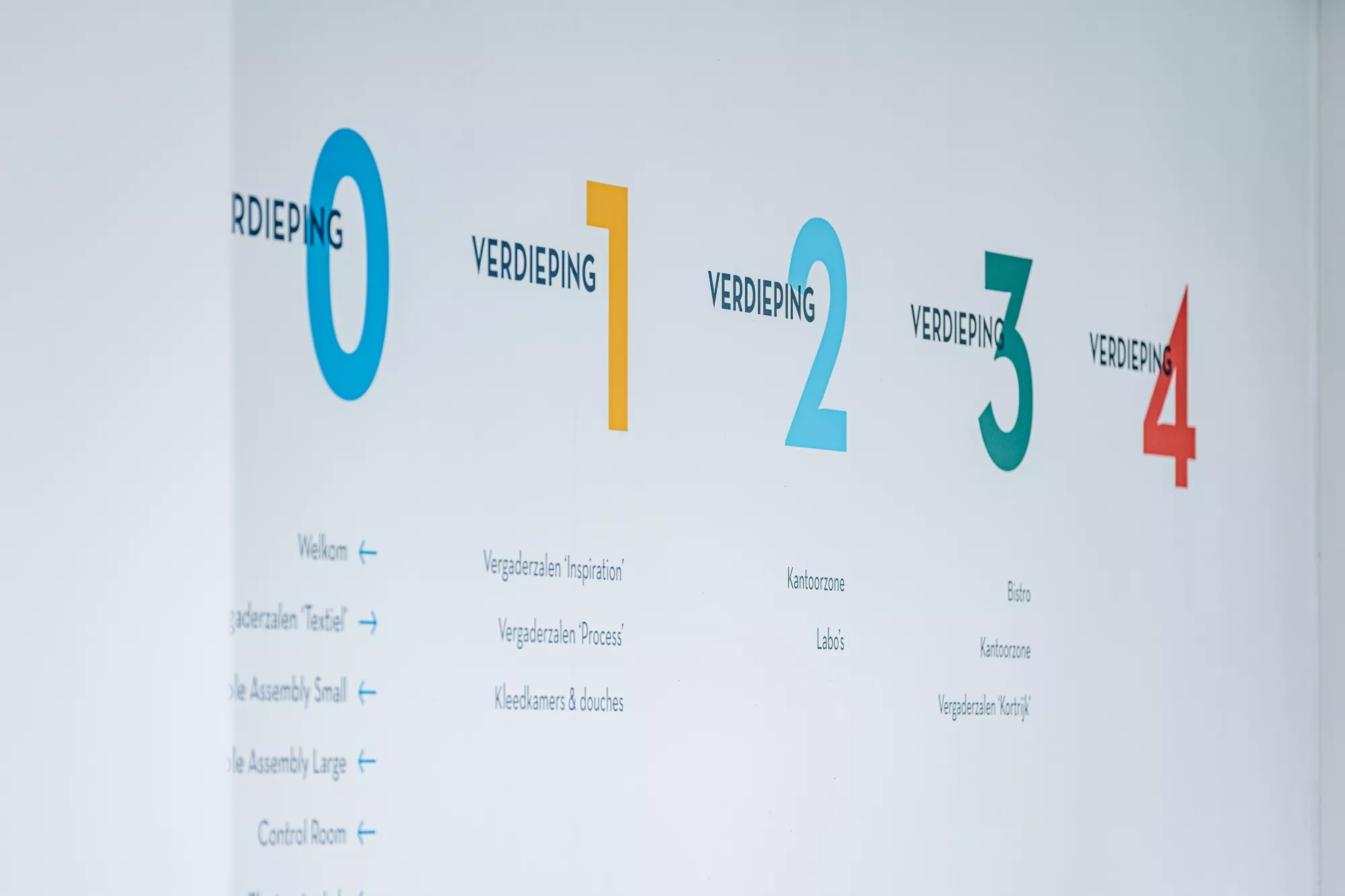
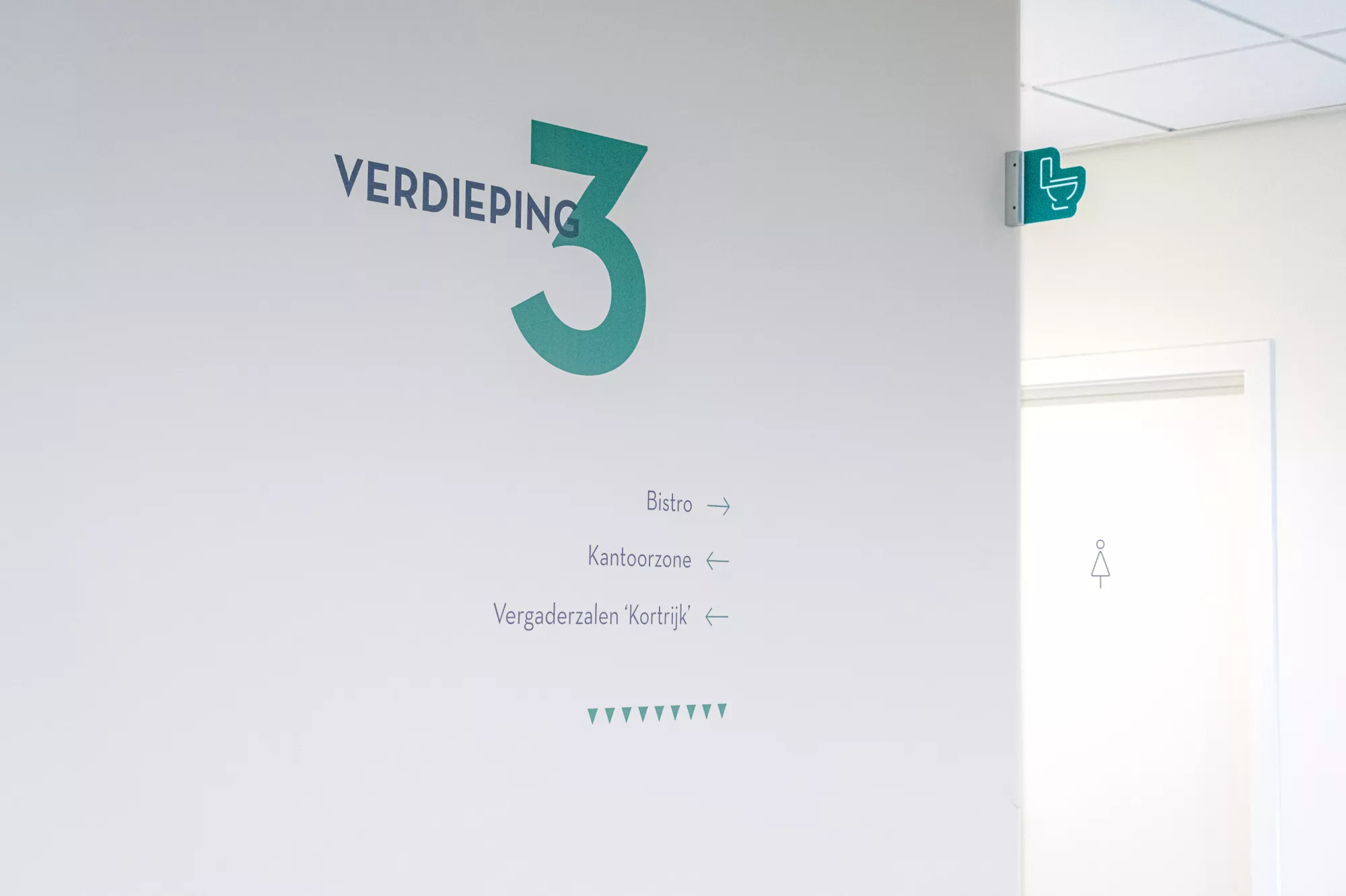
As a visitor, the overview of the floors welcomes you, along with several directional arrows. Signs then guide you to important areas such as meeting rooms, elevators and garages. We also gave clear markings to doors and made sure that the right-angled signage allows you to find functional areas such as toilets and meeting rooms at a glance.
One colour per floor
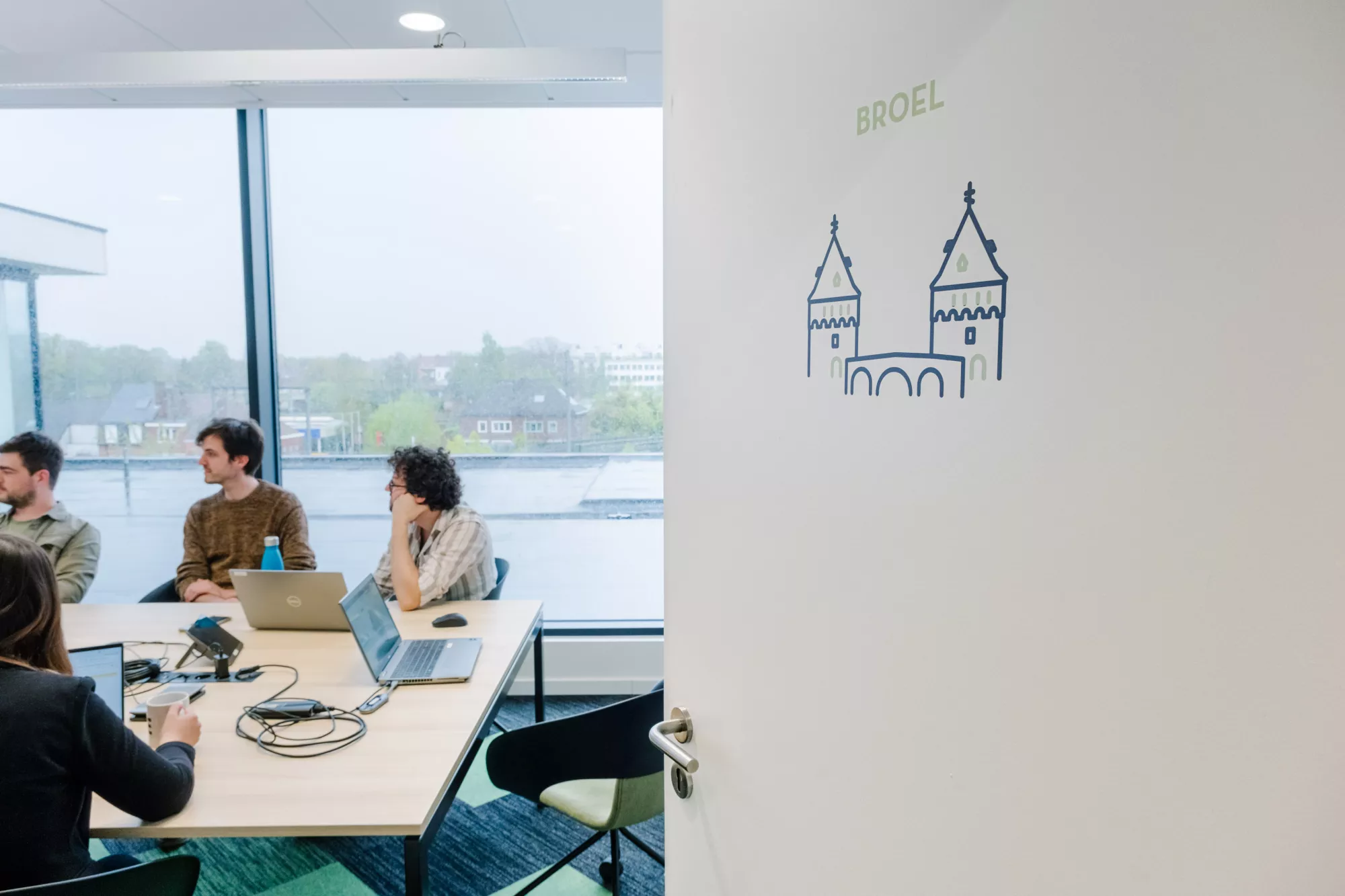
Each floor has its own colour code. That means you immediately know where you need to be - and where you currently are. And the meeting rooms? They each have their own bespoke icon, perfectly matching their name. Like “Wool” with a cute little sheep, “Inspiration” with a sparkling lamp, and “Cashmere” with a sweet old goat.
Even the mailbox got the designer treatment
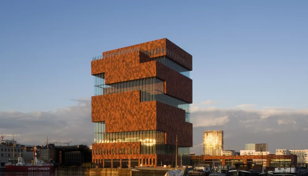
Just when we thought the whole signage project was finished, Flanders Make presented us with perhaps the most original question ever. As there was no mailbox for the building yet, we had to design a new one completely from scratch. Our graphics department drew its inspiration from the geometry, character and interplay of shapes of the new building to create a mailbox made up of two large, steel block shapes, fixed on a concrete base. It also comes in very handy for the many parcels that arrive there every day.
